Every Picture Is a Compromise
Lessons from the Also-rans
Most photography websites show the photographer's very best work. Wonderful. But that's not the full story of a creative life. If we want to learn, we'd better pay attention to the images that aren't "greatest hits" and see what lessons they have to offer. Every picture is a compromise — the sum of its parts, optical, technical, visual, emotional, and even cosmic – well, maybe not cosmic, but sometimes spiritual. Success on all fronts is rare. It's ok to learn from those that are not our best.
This is a series about my also-rans, some of which I've been able to improve at bit (i.e., "best effort"), none of which I would consider my best. With each there are lessons worth sharing, so I will.
Previous image | Next image |
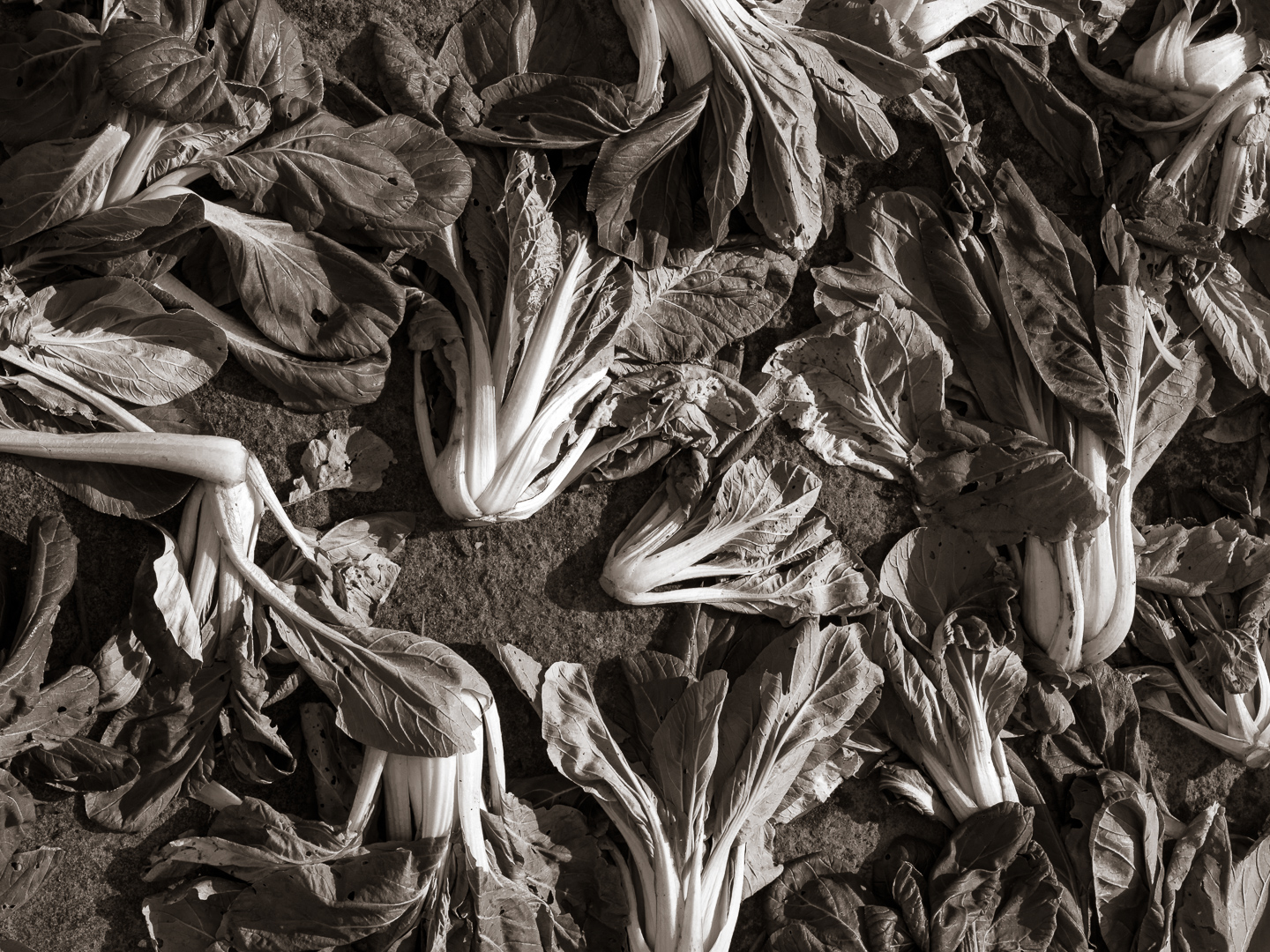
Original digital capture

It's a B/W World Week
Most photographers these days will create some images in color and some in b/w. What are the reasons for choosing b/w in this colorful world? Here are five good reasons for a b/w image: emphasize shapes, emphasize tones, fix unattractive colors, alter a specific color to a b/w tone, all about the light.
What I saw that I liked:
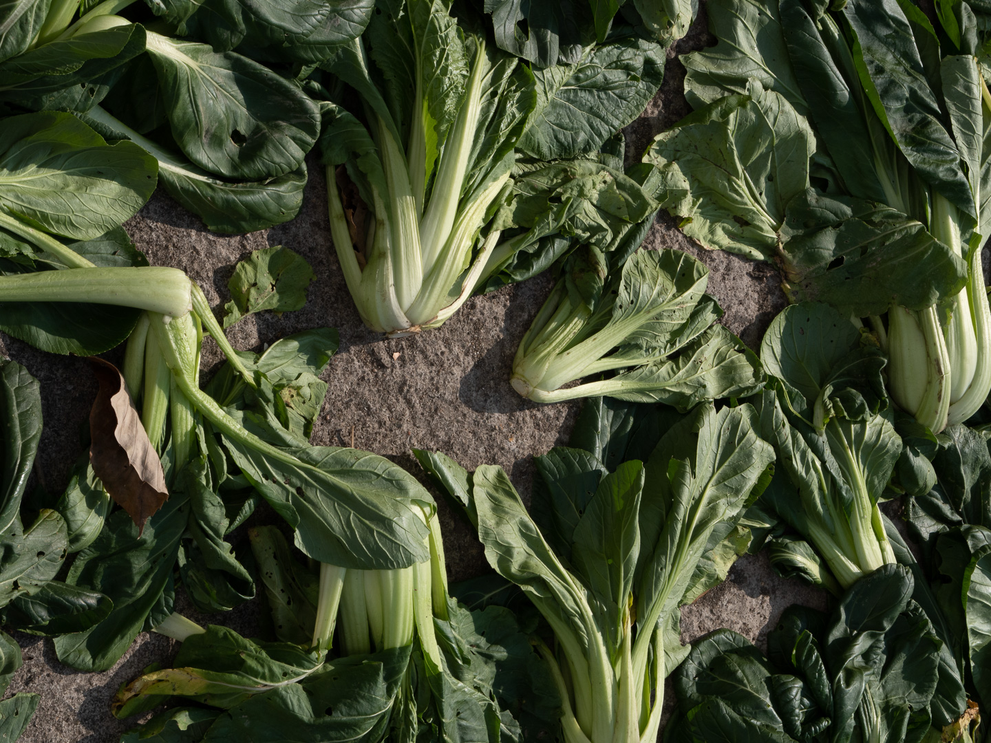
In China, I liked the patterns and shapes of these plants that had been harvested.
What I don't like in the picture:
Yes, the plants are colorful, but I wanted to emphasize the shapes.
What I learned:
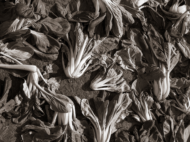
B/W is a common way to draw attention to a specific aspect of a subject by abstracting the photograph. In the b/w version, there is no doubt that the shapes are the intended vision.
2nd Chances: What I might try next
I might want to crop this to a square by cutting off the right side. Still undecided. |
|