Every Picture Is a Compromise
Lessons from the Also-rans
Most photography websites show the photographer's very best work. Wonderful. But that's not the full story of a creative life. If we want to learn, we'd better pay attention to the images that aren't "greatest hits" and see what lessons they have to offer. Every picture is a compromise — the sum of its parts, optical, technical, visual, emotional, and even cosmic – well, maybe not cosmic, but sometimes spiritual. Success on all fronts is rare. It's ok to learn from those that are not our best.
This is a series about my also-rans, some of which I've been able to improve at bit (i.e., "best effort"), none of which I would consider my best. With each there are lessons worth sharing, so I will.
|
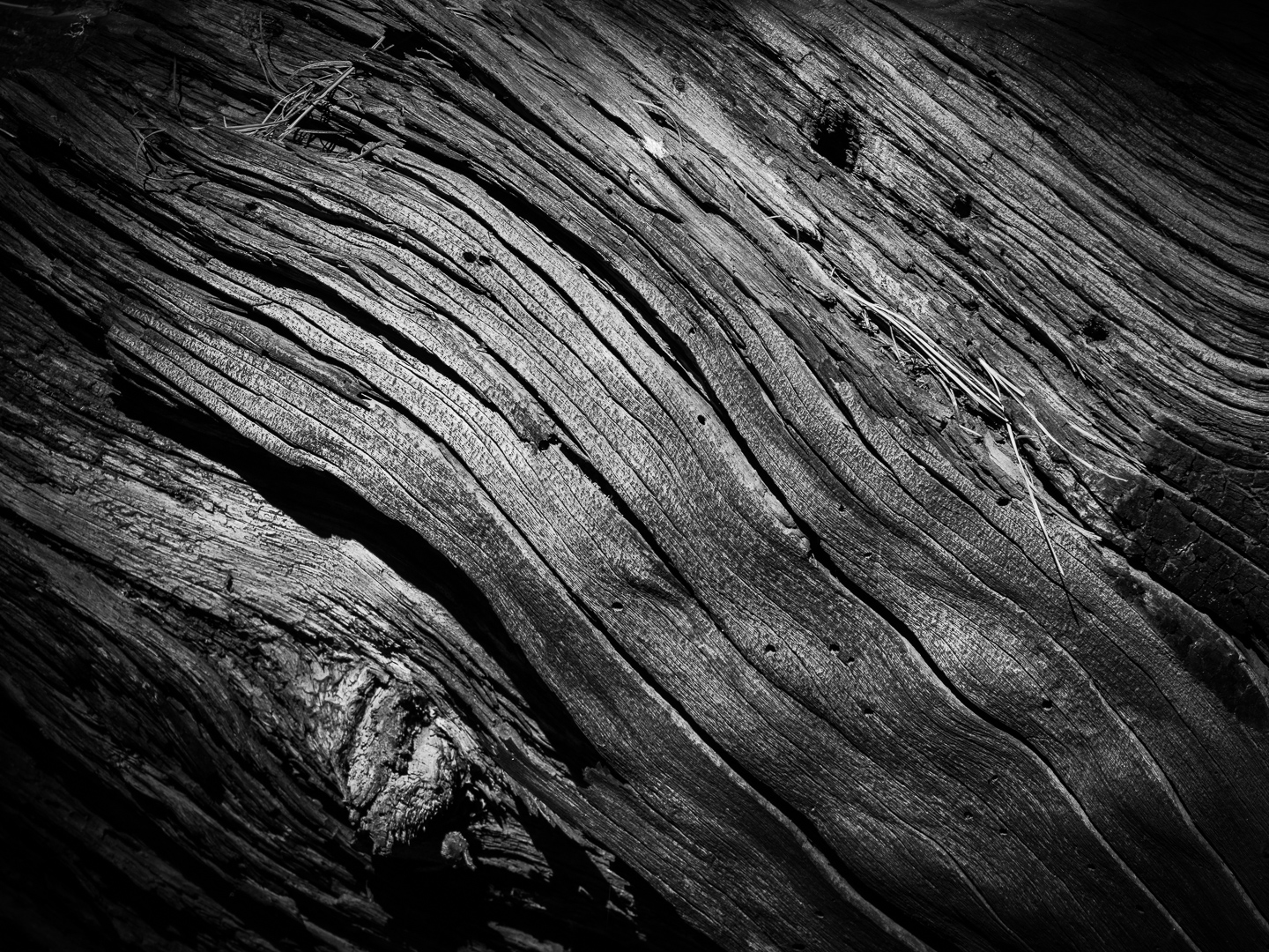
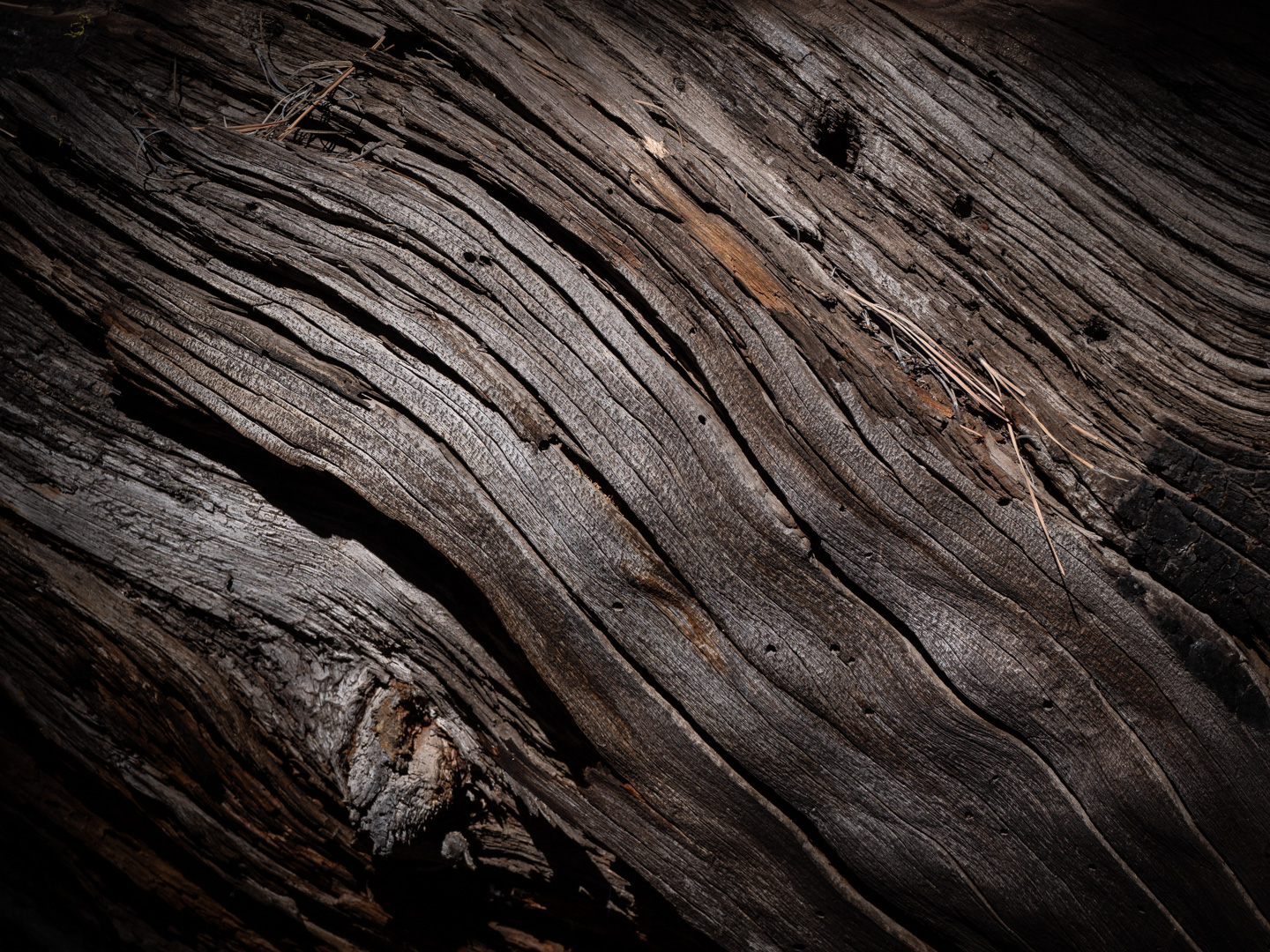
Original digital capture
Color or Grayscale WeekOne of the fundamental decisions in process our image is the question whether or not each image should be color or b/w. Sometimes this decision is unnecessarily complicated. Perhaps the answer is BOTH! What I saw that I liked:The first reaction to this fallen tree was to the texture and grain of the wood. The case for color:The color versions says, "tree" more realistically than the grayscale version at left. The question that needs to be answered is whether or not this is a project about trees or a project about wood. There is a difference. The case for grayscale:The grayscale version is more dramatic, probably because I increased the contrast — a common step in converting color images to grayscale ones. That increase in contrast makes the grayscale more textural in my opinion. In comparison, the grayscale almost makes the color version above look smooth. |