Every Picture Is a Compromise
Lessons from the Also-rans
Most photography websites show the photographer's very best work. Wonderful. But that's not the full story of a creative life. If we want to learn, we'd better pay attention to the images that aren't "greatest hits" and see what lessons they have to offer. Every picture is a compromise — the sum of its parts, optical, technical, visual, emotional, and even cosmic – well, maybe not cosmic, but sometimes spiritual. Success on all fronts is rare. It's ok to learn from those that are not our best.
This is a series about my also-rans, some of which I've been able to improve at bit (i.e., "best effort"), none of which I would consider my best. With each there are lessons worth sharing, so I will.
|
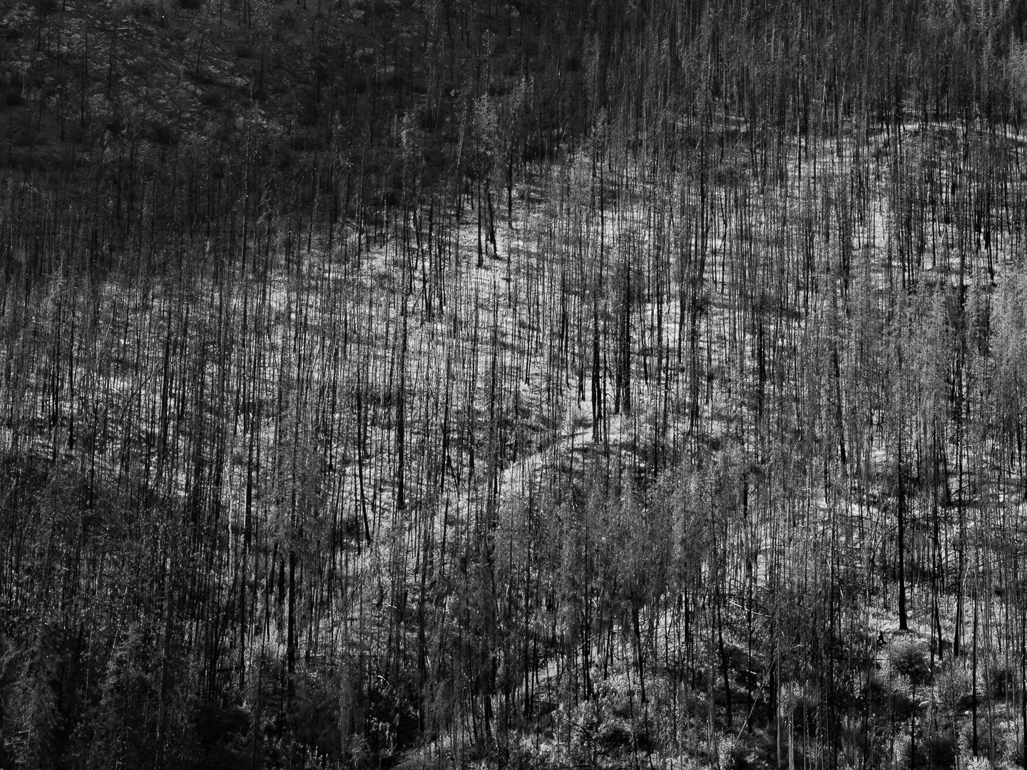
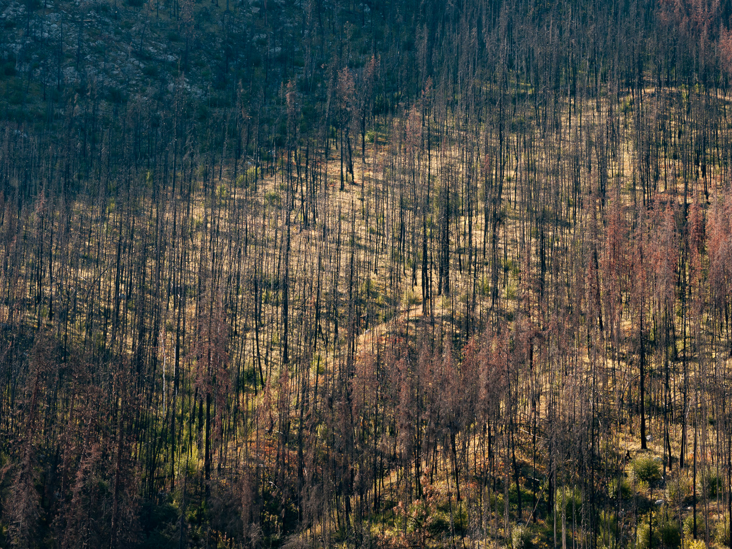
Original digital capture
What I saw that I liked:This burnt forest is one I've photographed on several occasions. I like the diagonal lines created by the contour of the hillside and the way they compliment the verticality of the trees. What I don't like in the picture:Artmaking is full of decisions and sometimes that is not easy. It this image color or b/w? What I learned:When an image is a stand-alone entity like wall art, for example, the decision to go color or b/w can involve both a tussle and a measure of indecision. I like both versions of this image, so which do I use and how do I decide? The answer lies in the project. I could see both versions of this image fitting beautifully in different projects. Rather than the content of the image being the determining factor, let the project and context make the decision. |