Every Picture Is a Compromise
Lessons from the Also-rans
Most photography websites show the photographer's very best work. Wonderful. But that's not the full story of a creative life. If we want to learn, we'd better pay attention to the images that aren't "greatest hits" and see what lessons they have to offer. Every picture is a compromise — the sum of its parts, optical, technical, visual, emotional, and even cosmic – well, maybe not cosmic, but sometimes spiritual. Success on all fronts is rare. It's ok to learn from those that are not our best.
This is a series about my also-rans, some of which I've been able to improve at bit (i.e., "best effort"), none of which I would consider my best. With each there are lessons worth sharing, so I will.
|
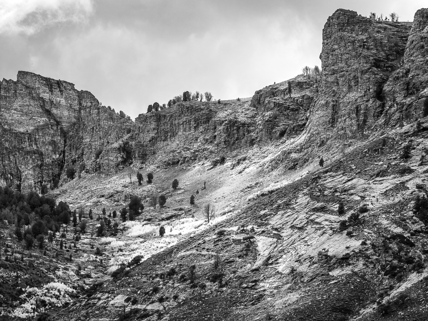
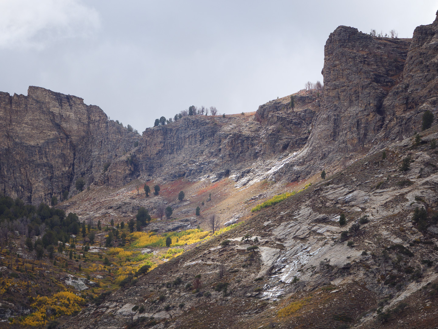
Original digital capture
What I saw that I liked:Fall color is spectacular, especially in the Rocky Mountains. What I don't like in the picture:Although I do love the color in the version above, it's intense colors leave me felling like I'm looking at a candidate for a picture calendar. What I learned:The b/w at left is a conversion of the color rendition in the above. Same capture, just processed for b/w. I did shift some of the grayscale tones around with the Color Mixer sliders in Lightroom to emphasize those light tones in the middle. In this case, I could see a purpose for both of these images, that is to say, one version is not "better" than the other. They are just different. Each rendition probably had a place in a project somewhere. This is another reason why I try not to make processing decisions in the field. I never know how I will want to use an image in a project until I do. |