Every Picture Is a Compromise
Lessons from the Also-rans
Most photography websites show the photographer's very best work. Wonderful. But that's not the full story of a creative life. If we want to learn, we'd better pay attention to the images that aren't "greatest hits" and see what lessons they have to offer. Every picture is a compromise — the sum of its parts, optical, technical, visual, emotional, and even cosmic – well, maybe not cosmic, but sometimes spiritual. Success on all fronts is rare. It's ok to learn from those that are not our best.
This is a series about my also-rans, some of which I've been able to improve at bit (i.e., "best effort"), none of which I would consider my best. With each there are lessons worth sharing, so I will.
|
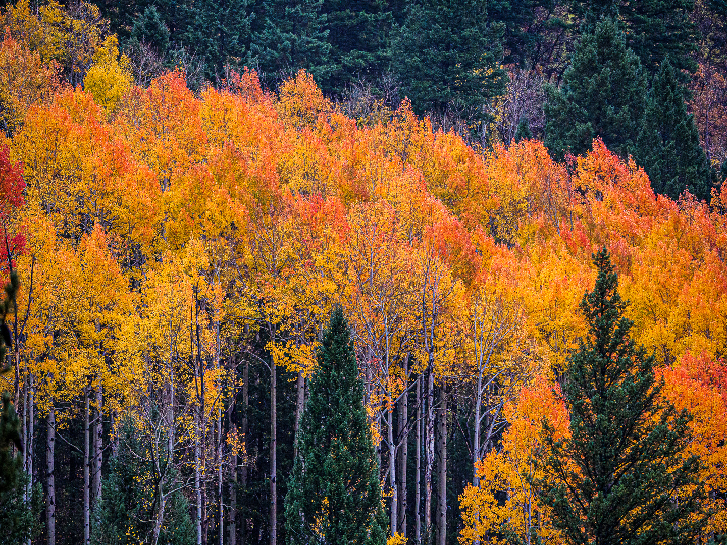
Original digital capture
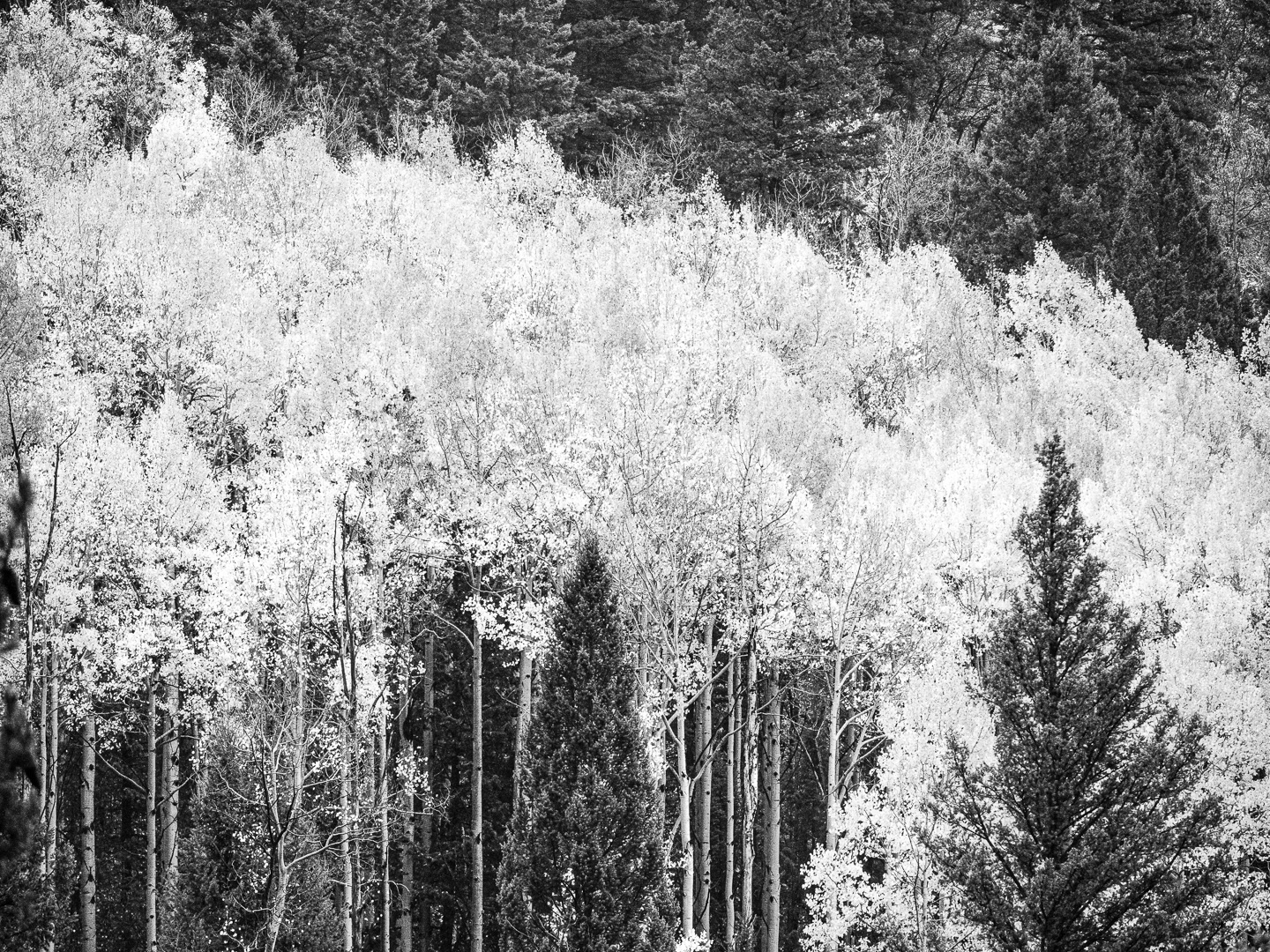
What I saw that I liked:This is the opposite of yesterday's image. What I don't like in the picture:The above attempt to convert this to a b/w is okay, but what captured my eye in the scene (at left) was not a single color but the subtle variety of colors — yellows, oranges, even a few red leaves, all in contrast to the dark greens of the evergreens. What I learned:I keep coming back to a simple yet clarifying question: What is this picture about? Let the answer to this question dictate the processing. In this example, I like both versions, but there is no question that the answer that comes to my mind more readily is COLOR. Doesn't mean I won't use the b/w version above in the right kind of project, but that would have to be a project that is about luminance, not hue. |