Every Picture Is a Compromise
Lessons from the Also-rans
Most photography websites show the photographer's very best work. Wonderful. But that's not the full story of a creative life. If we want to learn, we'd better pay attention to the images that aren't "greatest hits" and see what lessons they have to offer. Every picture is a compromise — the sum of its parts, optical, technical, visual, emotional, and even cosmic – well, maybe not cosmic, but sometimes spiritual. Success on all fronts is rare. It's ok to learn from those that are not our best.
This is a series about my also-rans, some of which I've been able to improve at bit (i.e., "best effort"), none of which I would consider my best. With each there are lessons worth sharing, so I will.
Previous image | Next image |
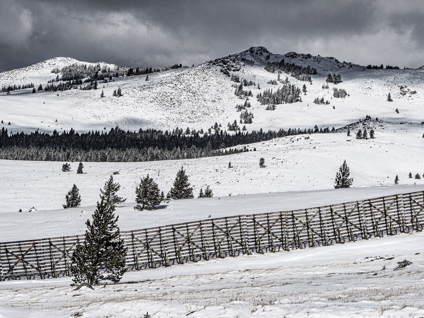
Original digital capture
Subtle Color Week
The current passion of so many photographers these days is to hyper-saturate the colors in their images to unrealistic intensity. Viewing these images always feel like I'm being shouted at. Is there not an aesthetic that celebrates subtle colors? Of course there is.
What I saw that I liked:
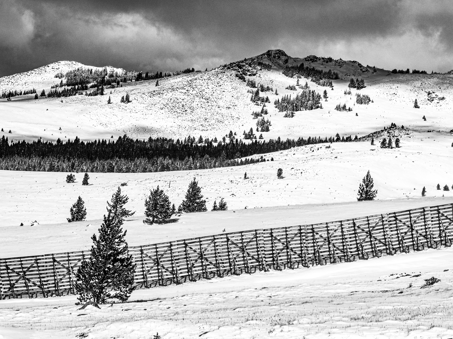
My first inclination with this image was to convert it to b/w. I do this a lot. For the first 35 years of my photographic life I did only b/w images. It's my roots.
What I don't like in the picture:
There is a very subtle blue in the sky of the image at left that I thinks adds a hint of stormy sensation. That hint of blue was eliminated in the b/w version above.
What I learned:
The more I looked at the color version my camera captured, the more I began to see a compromise between the RAW full color capture and the b/w above. This was one of the first images that educated me about the possibility of a more subtle aesthetic with color. |
|