Every Picture Is a Compromise
Lessons from the Also-rans
Most photography websites show the photographer's very best work. Wonderful. But that's not the full story of a creative life. If we want to learn, we'd better pay attention to the images that aren't "greatest hits" and see what lessons they have to offer. Every picture is a compromise — the sum of its parts, optical, technical, visual, emotional, and even cosmic – well, maybe not cosmic, but sometimes spiritual. Success on all fronts is rare. It's ok to learn from those that are not our best.
This is a series about my also-rans, some of which I've been able to improve at bit (i.e., "best effort"), none of which I would consider my best. With each there are lessons worth sharing, so I will.
|
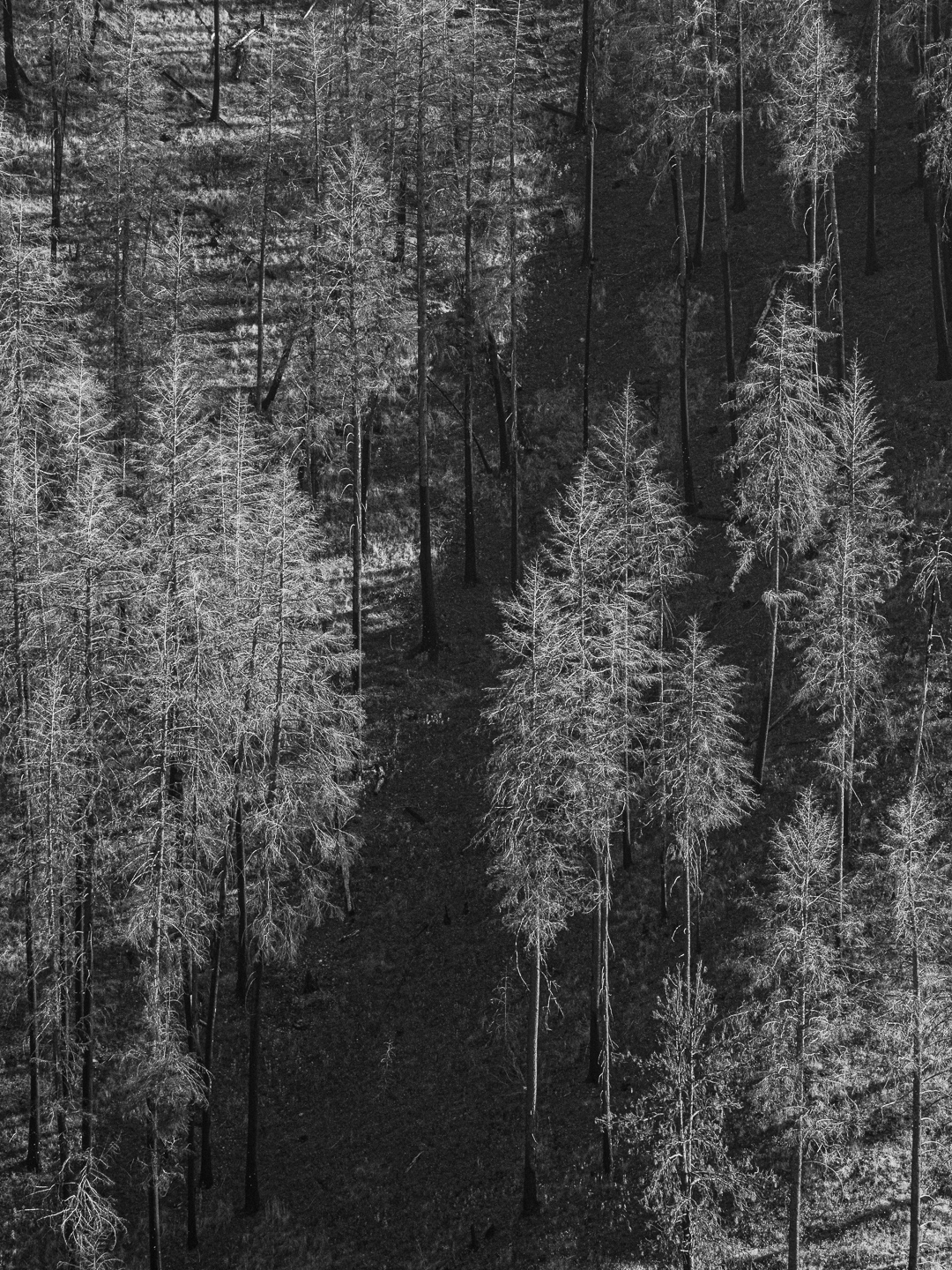
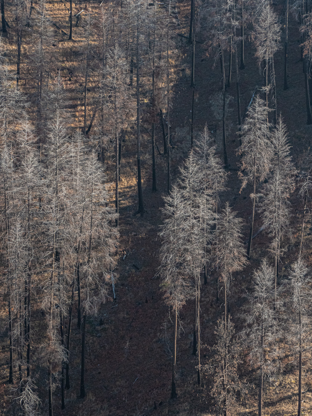
Original digital capture
Color or Grayscale WeekOne of the fundamental decisions in process our image is the question whether or not each image should be color or b/w. Sometimes this decision is unnecessarily complicated. Perhaps the answer is BOTH! What I saw that I liked:Some scenes just don't have much color in them to begin with. This is a year after a major forest burn just south of John Day, Oregon. The case for color:That hint of orange color in the top half tends to emphasize the lack of color in the burn trees. Because the burnt trees are monochromatic, you could almost call this a mixed color image. The case for grayscale:If the objective is to show the starkness of the post-burn scene, then the grayscale image does a better job of emphasizing the tiny twigs left on the trees. the textures leap off the page in contrast to the dark hillside. As we'll see all week this week, each of these images has an advantage depending on the project. I wouldn't rate either of them better, but each may be better suited to a given project. |