Every Picture Is a Compromise
Lessons from the Also-rans
Most photography websites show the photographer's very best work. Wonderful. But that's not the full story of a creative life. If we want to learn, we'd better pay attention to the images that aren't "greatest hits" and see what lessons they have to offer. Every picture is a compromise — the sum of its parts, optical, technical, visual, emotional, and even cosmic – well, maybe not cosmic, but sometimes spiritual. Success on all fronts is rare. It's ok to learn from those that are not our best.
This is a series about my also-rans, some of which I've been able to improve at bit (i.e., "best effort"), none of which I would consider my best. With each there are lessons worth sharing, so I will.
|
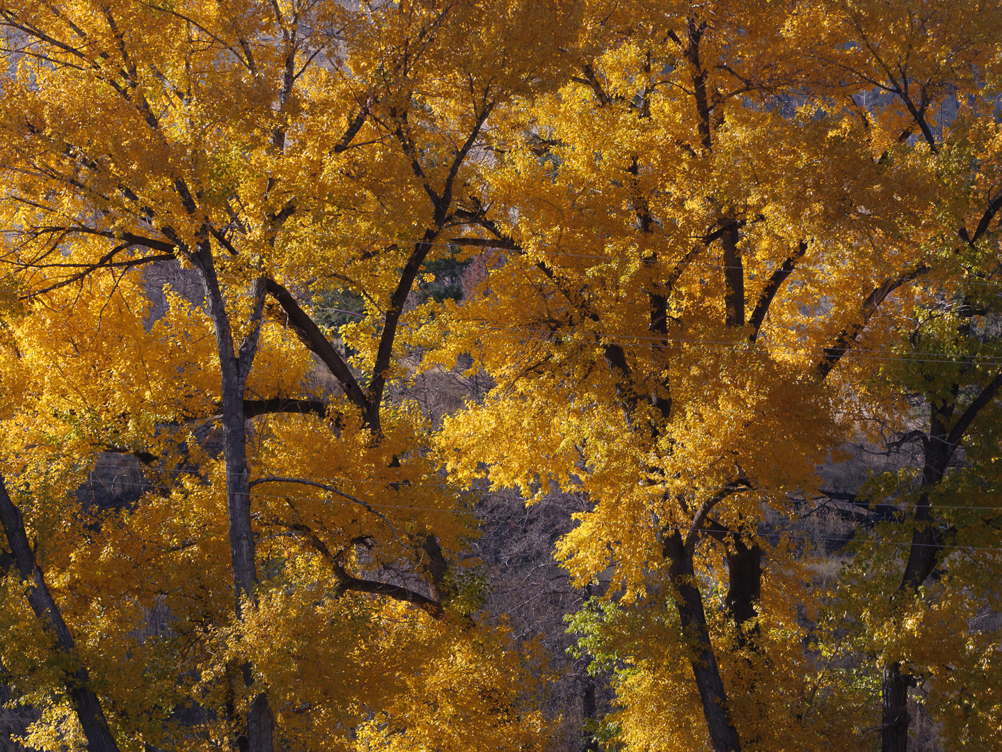
Original digital capture
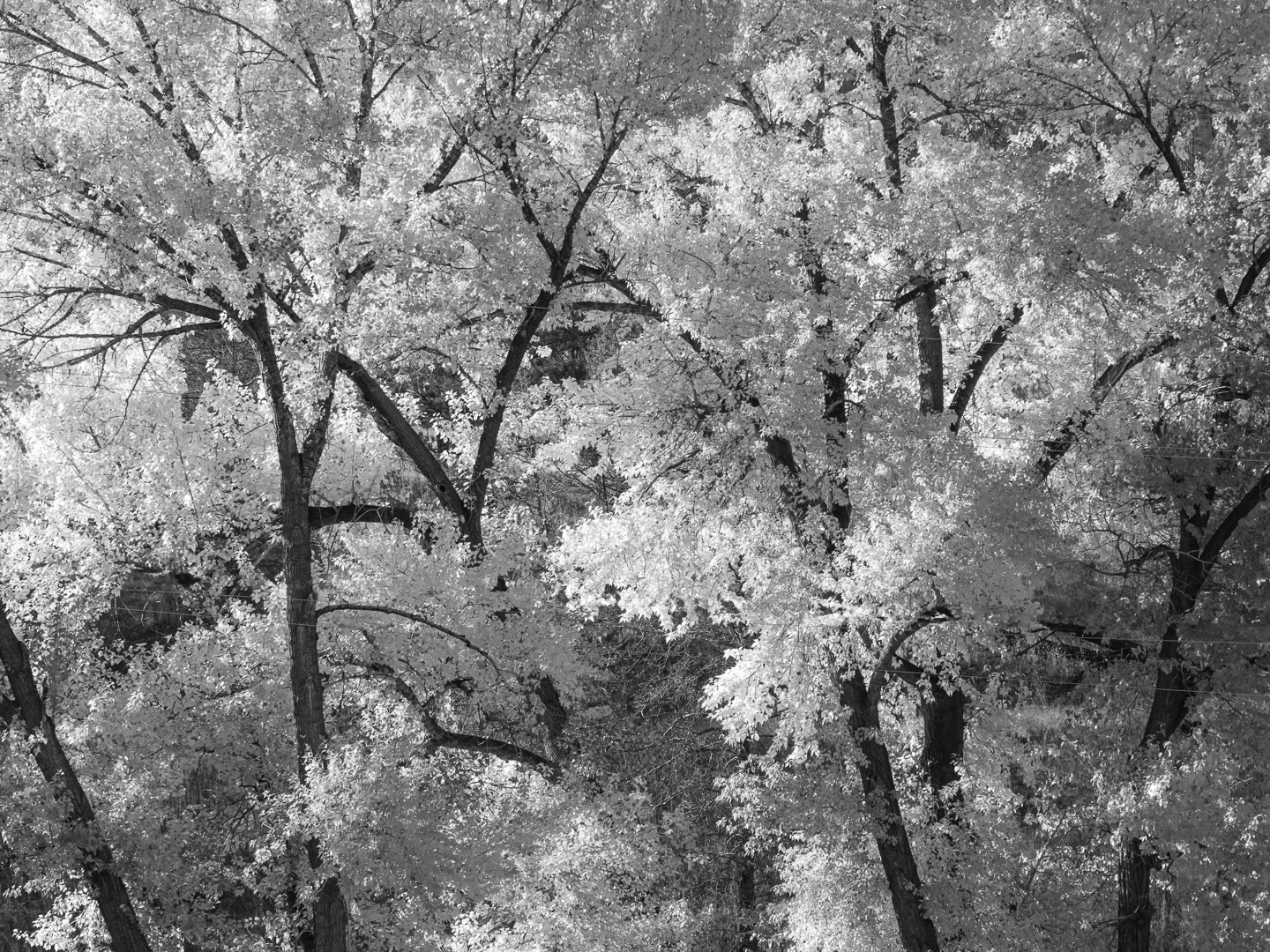
Color or Grayscale WeekOne of the fundamental decisions in process our image is the question whether or not each image should be color or b/w. Sometimes this decision is unnecessarily complicated. Perhaps the answer is BOTH! What I saw that I liked:Wow, the yellow in this cluster of trees is an avalanche of color. The case for color:I used this image in its full color for a project about color. The title of the project is Yellow, Oh My! Obviously, the color version was the only choice for this project about the color yellow itself. The case for grayscale:Where the color version screams YELLOW, the grayscale version above screams LIGHT. I could easily see this image in a project all about back-lit leaves and how they just glow. In fact, I should do that! |