Every Picture Is a Compromise
Lessons from the Also-rans
Most photography websites show the photographer's very best work. Wonderful. But that's not the full story of a creative life. If we want to learn, we'd better pay attention to the images that aren't "greatest hits" and see what lessons they have to offer. Every picture is a compromise — the sum of its parts, optical, technical, visual, emotional, and even cosmic – well, maybe not cosmic, but sometimes spiritual. Success on all fronts is rare. It's ok to learn from those that are not our best.
This is a series about my also-rans, some of which I've been able to improve at bit (i.e., "best effort"), none of which I would consider my best. With each there are lessons worth sharing, so I will.
|
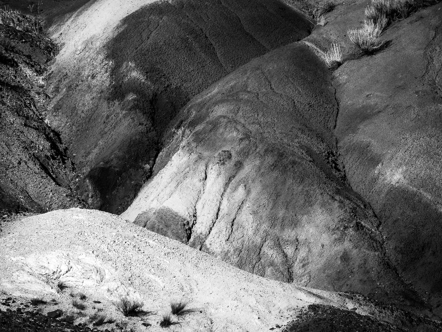
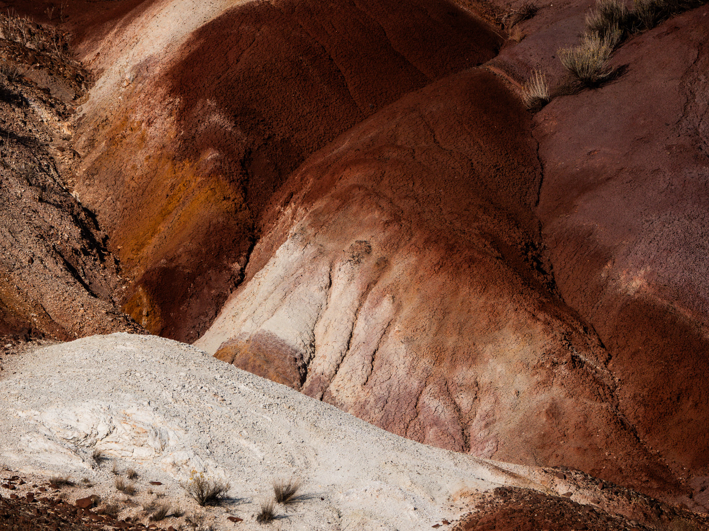
Original digital capture
Color or Grayscale WeekOne of the fundamental decisions in process our image is the question whether or not each image should be color or b/w. Sometimes this decision is unnecessarily complicated. Perhaps the answer is BOTH! What I saw that I liked:Believe it or not, the color version above is an accurate rendition of the colors in this bentonite hillside. Very deep rust color and white soil right next to it. The case for color:Bentonite hills do tend to be colorful. This image is from the Painted Hills in central Oregon. If I were doing a project about the Painted Hills, I would choose the color version. The case for grayscale:the grayscale version was used in a project about soil erosion in the desert. Using the color rendition would have converted the topic from water to colors in the soil. Another example of choosing the rendition of the scene based on the context of the project and its message. |